Quick Tips for Creating a Great Notion Dashboard

Intro
Notion is a powerful tool for note-taking and being productive. Its flexible tools allow users to manage tasks, create documentation, track projects, and more. With these tools, you can easily create and design pages by dragging and dropping the necessary components.
One use case for it is a Notion dashboard, which provides an overview of everything at a glance. Having all the essential things on one page at once lets you quickly get an overview of your life, manage deadlines, and have the essential tools all in one place.
Creating a dashboard is a bit of an art and there are some tricks you can learn and apply to create your Notion dashboard.
Tips
Focus on a Theme or Purpose
Before starting, it helps to think of the Notion dashboard’s overall theme or purpose, which depends on your life situation. For example, if you are a student, the components will contain content related to your academics such as assignment deadlines, quick links to your notes, and to-do lists. Coming up with a theme or purpose will help you decide what kind of components you want to add to your dashboard.
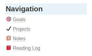
Make Your Pages Accessible by Creating Navigation Menus
Your Notion dashboard can serve as a portal to your other pages. You can achieve this by creating navigation menus. To do that, start by creating a header. Then underneath that, add lines of text where each line represents a menu label. Then link each label to your pages or to another resource. That way, you can get to your pages conveniently.

Keep Your Notion Dashboard Simple
I have seen many examples of complicated dashboards that people have made with Notion. While they look great, they also look cluttered with too many components. With such messy layouts, this could actually be a hindrance to your productivity. I would even wonder if people even use those components often. A dashboard should only provide the most essential pieces of information and you should be able to see all that information quickly. A complicated dashboard will not help you achieve this and will overwhelm you instead.
In general, keep the design of your dashboard minimalistic.
Use Dividers and Columns
Dividers and columns add some depth to your Notion dashboard. You can use them to group relevant content and distinguish the groups from other components. You could also use columns to reduce the amount of white space if a component doesn’t need to fit the entire screen. This improves the clarity of your dashboard and guides the design of your dashboard.
Here is a quick example of how you could use dividers and columns for your dashboard.
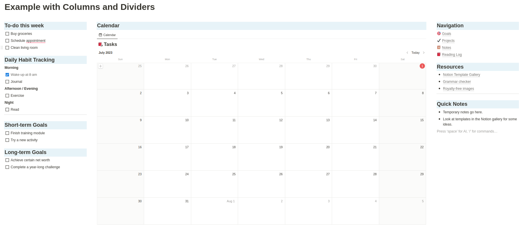
In this example, I created 3 columns where I grouped my to-dos and tasks on the left side, put the calendar in the middle column, and then put my navigation, resources, and quick notes blocks on the right. There are definitely ways to improve this dashboard, but the basic idea behind this is to have each column contain blocks that are similar to each other.
Sync Your Blocks with Linked Databases
A great feature with Notion is that you can sync blocks across pages where information on one page can be displayed on another. One application of this is to track upcoming deadlines for your tasks. To do this, create a database. Then on your dashboard, create a block and select a type of view. Your view can be a table, a list, a calendar, a board, a gallery, or a timeline. You will then see your database on your dashboard.
In the example Notion dashboard image above, you can see that I added a calendar view for my tasks. The data is loaded from my “Tasks” database where any task item with a date will appear on this calendar. You can take it one step further by adding a filter so that only certain tasks appear in your view.
See this Notion documentation page for how to use linked databases.
Look at Other Templates for Inspiration
If you are ever stuck while designing your dashboard, do not be discouraged! Notion’s template gallery has a ton of templates available, including dashboards. Take a browse through them and take note of the ideas you like. Then replicate them with your dashboard. You could even take a pre-existing template and tweak it to speed up the process.
Spiff It Up with Icons, Images, Colours, and More
Notion dashboards can be a lot more than just text and blocks. It offers design elements to add style to your pages. Here are some ways to style your dashboard:
Callouts
Callouts are blocks that have a colored background. This makes the content stand out more and users can change the color to the many options available.
Colors
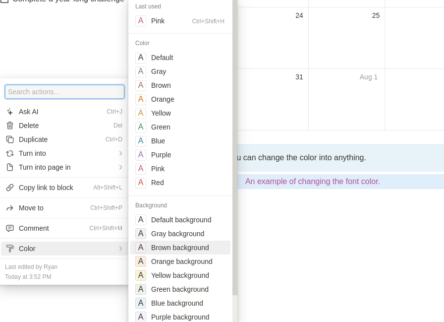
Notion offers the ability to change the font color and the background color of the block surrounding the font.
To change the color of the font or its background, hover over the text, then click on the 6 dots icon that appears on its left. Then hover over the color and select the color of your choice. Note that you can change either the color of the font or the background, but not both. If you would like to change both, consider using a callout instead.
Images
Images can help fill up any unused space to avoid having any awkward empty spots in your Notion dashboard. Below is a simple example of how adding images can improve the look of your dashboard. The images come from this Reddit post.

Fonts
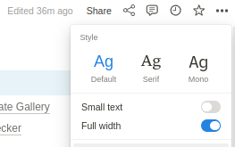
Notion supports 3 font types: Default, Serif, and Mono. You can find these by clicking on the 3 dots (…) icon at the top right of your screen and then selecting a font. These can help give your Notion dashboard a different look.
KaTeX
You can also use KaTeX, a typesetting library for writing math equations for some custom font formatting. Although they are a bit limited in styling and you need to know how to write its syntax, it is an option. You can find the list of supported KaTeX syntax here.
Review and Revise
At some point, you may find that you could improve your Notion dashboard. With the current iteration of your dashboard, see how it has impacted your productivity. Then, see what changes you could make to improve it even more. Examples of changes could include adding a missing block, removing unnecessary widgets, or choosing better colors. Do not spend too much time trying to improve it though; just focus on adding the elements you need and then review it every once in a while.
Conclusion
There is a lot you can do to make your Notion dashboard look great. From layout changes to colors, you have a wide range of tools available. Don’t worry about making it perfect right away though. A dashboard, like your other Notion pages, can be an iterative work in progress. Focus on adding the content you need for your dashboard and then work on improving it over time.